Dear blogfriends,
As promised, I'd like to share with you some tips to create a children friendly family room.
I strongly believe that design and family can and even must go together.
Of course, you'll probably have to hide your beautiful and fragile knick-knacks or avoid über cool bar card.
But you still can create an inviting, cosy and pretty space that will (also) be yours.
Credit : Aprill Aprill
1. Inviting sofas :
Our sectionnal sofa is huge and takes a big part of the space in our family room.
But I definitely don't regret our choice. It delimitates the space very well.
In a family room it's important to have a place to rest, sit, nap, play, eat, cuddle, read books, etc. Our Ikea Karlstad sofa is perfect for that : it is comfy, not precious.
And don't be afraid to choose light colors. Just choose slipcover!
2. Coffee tables :
A big, nice, inviting sofa is important. A coffee table isn't.
If you don't have enough space, just get rid of your coffee table. You can easily use poufs (on which you'll be placing a tray) or small side tables if you need some support surface.
You can also install a console behind your sofa like on the pics below.
(this is an awesome babyproofed design by Emily Henderson, one of my favorite designer. You can find all the breakdown - and other amazing tips - here).
Credit : Oh joy
Credit : The design chaser
Credit : Norske interior blogger
Also, avoid sharp angles and choose for a round coffee table.
3. Kids chairs :
Your kid needs his own chair. Anouk loves to sit on her chair to drink or eat some snack. She knows it is her place and I believe it makes her feel confident.
The best thing is that you can find awesome vintage chairs or you can buy some reedition of design classics for a very reasonable budget.
Credit : The glitter guide
Credit : Mykeminutter
4. Storage for kids
Older kids love to play (and hide) in their room. But toddlers love to play close to/with their parents.
You can store all the toys in the nursery, they will somehow reappear in the living room.
The best compromise is to dedicate some storage in the living room and rotate the toys once in a while.
Credit : My Ideal Home
Credit : The Design Files
Credit : Honest Infomercial reviews
If you have pretty toys, you even can display them!
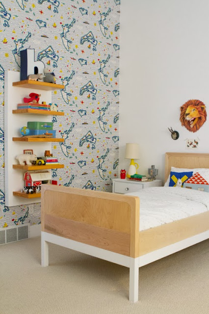
5. (If you can) Create nooks or spaces that are their own!
You may have a weird nook that you are not really using. A wall that remains blanco. Pinterest is full of amazing idea to create a unique nook for your kid.
Credit : Link
Credit : Fun At Home With Kids
Credit : Design Sponge
6. Keep it simple
Of course you can style your console or coffee table! As long as you keep it simple : trays (perfect to secure drinks), some candles, wooden animals or non toxic flowers...
But keep your art books and precious china out of reach...
Credit : Nordic Leaves
Credit : That Nordic Feeling
Credit : Link


